


100 Years of Matsuya Ginza
Ginza 3-Chome Centennial Chronicle
Episode 7
Thanks to your continued support, Matsuya Ginza celebrates its 100th anniversary in 2025.
In this special series, we revisit the unique stories and moments that have unfolded in Ginza 3-Chome, as we explore the spirit and identity of Matsuya Ginza.
Shokaku Mark
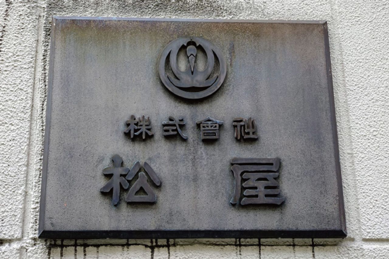
This design, featuring pine needles layered on the wings of a crane viewed from the front, is the Matsuya corporate emblem called the Shokaku Mark. Both the pine and the crane are auspicious symbols, representing a good omen of "eternal prosperity." Since the corporate identity (CI) change in 1978 (Showa 53), the mark has become less common, but it is still used in limited places such as the company flag on the rooftop, employee lapel badges, and as a nameplate substitute at the Kyobashi entrance.
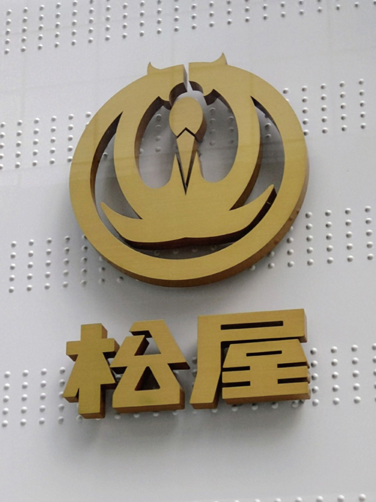
Matsuya was originally founded in 1869 (Meiji 2) as "Tsuruyagofukuten" in Yokohama. Later, in 1889 (Meiji 22), it acquired "Matsuya Gofukuten" at Kanda Imagawa Bridge, inheriting the two store names Tsuruyaya and Matsuya. Around 1907 (Meiji 40), they began using a common Shokaku Mark for both stores. Originally, Tsuruyaya and Matsuya each used separate trademarks, but with the expansion of the Imagawa Bridge store and the transition from a kimono shop to a department store, there was growing momentum to unify the marks for both stores.
They commissioned Professor Mataro Ide of Tokyo Higher Technical School (now Tokyo University of Science) to hold a design competition among students. From this contest emerged the concept that became the basis of the Shokaku Mark. With Professor Ide’s refinement, the mark took almost its present form. The mark was first unveiled when Matsuya participated in the "Tokyo Industrial Exposition" held in Ueno in March 1907 (Meiji 40). After further adjustments to proportions and line thickness for the most balanced and beautiful design, the finalized Shokaku Mark was completed and remains in use today.
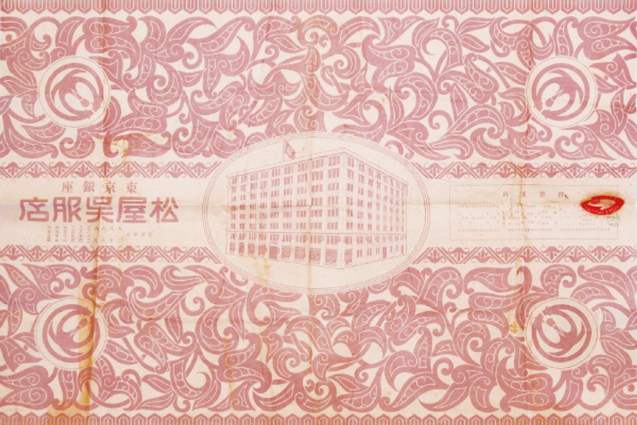
In the past, department store logos were mostly designs featuring a shape or a single kanji character inside a circle. This was the case for Mitsukoshi, Takashimaya, Isetan, Daimaru, Sogo, and also the Shokaku Mark of Matsuya. It is said that this tradition originated from kimono shops placing their store seals within circles at both ends of the fabric bolts.
The Matsuya Shokaku Mark was widely used in advertising, wrapping paper, and other materials for about 70 years until the current MATSUYA GINZA logotype was introduced in 1978 (Showa 53). Today, it can be regarded as a symbol representing Matsuya’s history.
Now, here is a special episode. The designer who handled the 1978 CI* change for Matsuya Ginza was the late Masayoshi Nakajo. When I met him at a design exhibition party held at Matsuya Ginza in the 2000s, I asked him about a certain hypothesis:
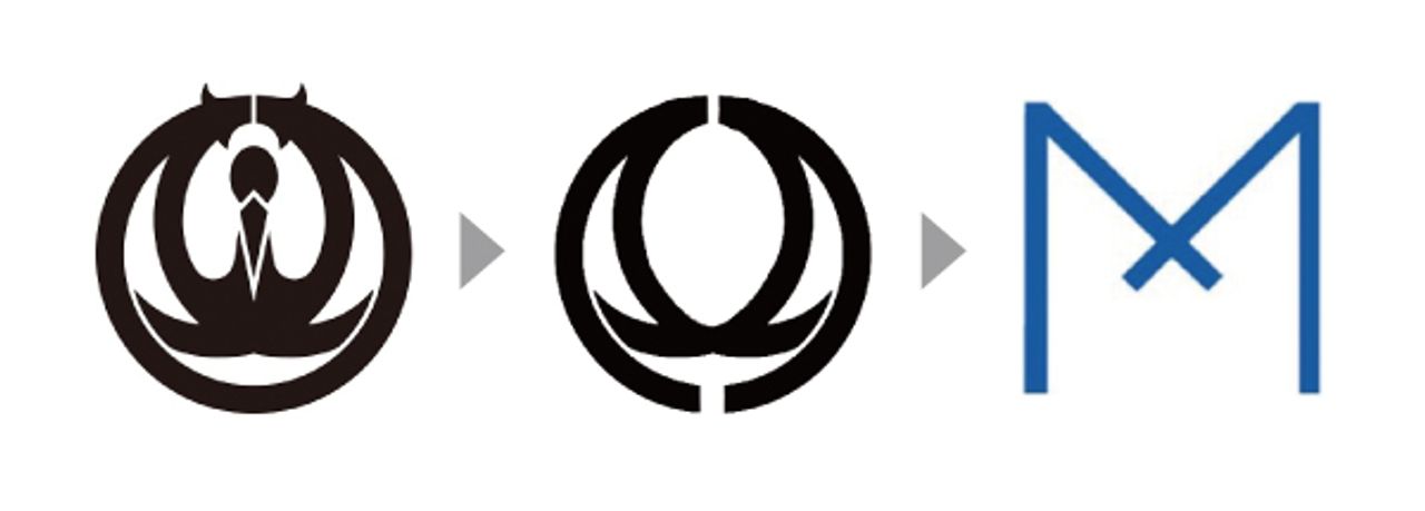
“Is the ‘M’ mark after the CI change a transformed version of the Shokaku Mark?”
To which Nakajo casually replied, “Yes, that’s right.” Indeed, if you take the crossed pine needles (which also represent the crane’s wings) seen in the Shokaku Mark and open the lower part to deform it, you get the “M” in Matsuya’s promotional mark (or the “M” part of the MG mark). The DNA of the Shokaku Mark was quietly inherited.
*CI = Corporate Identity, a strategy to unify and clarify a company’s philosophy and values through design, thereby enhancing brand value.
Author: Ken Tashiro
Principal of the Tokyo Fashion College of the Matsuya Group. With a career spanning over 40 years dedicated to the Matsuya Group, he has served as deputy editor for the "150-Year History of Matsuya" and held various other key roles.

Previous and next issues available here