

100 Years of Matsuya Ginza
Ginza 3-Chome Centennial Chronicle
Episode 8
Thanks to your continued support, Matsuya Ginza celebrates its 100th anniversary in 2025.
In this special series, we revisit the unique stories and moments that have unfolded in Ginza 3-Chome, as we explore the spirit and identity of Matsuya Ginza.
Matsuya Ginza Logotype
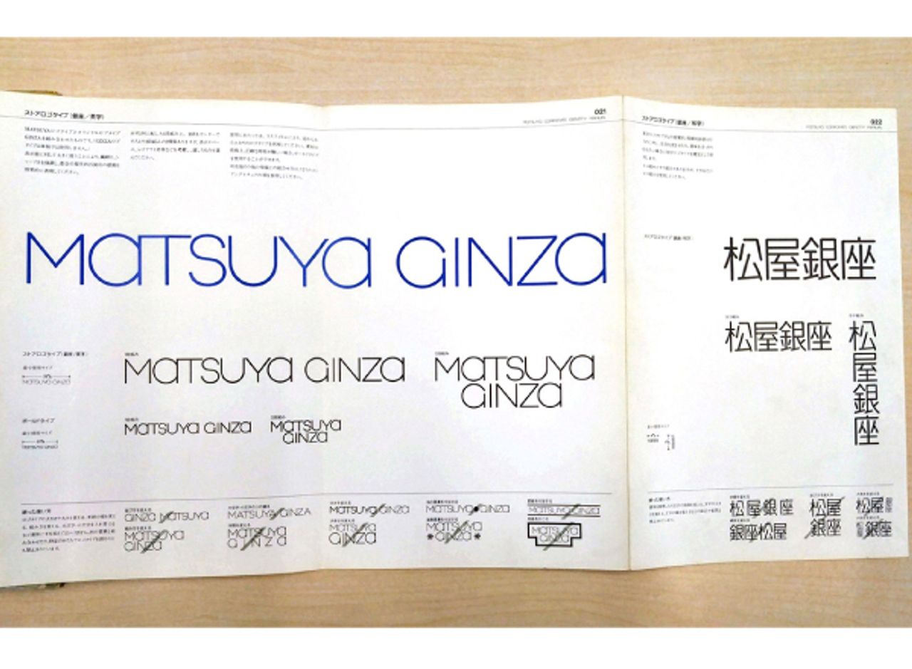
The MATSUYA GINZA logotype was introduced in 1978 (Showa 53). When Matsuya undertook a CI* change—a pivotal move for the company—the Shokaku Mark, which had been widely used in advertising and wrapping paper, was replaced by this horizontal logotype as its main symbol.
*CI = Corporate Identity, a strategy to unify and clarify a company’s philosophy and values through design, thereby enhancing brand value.
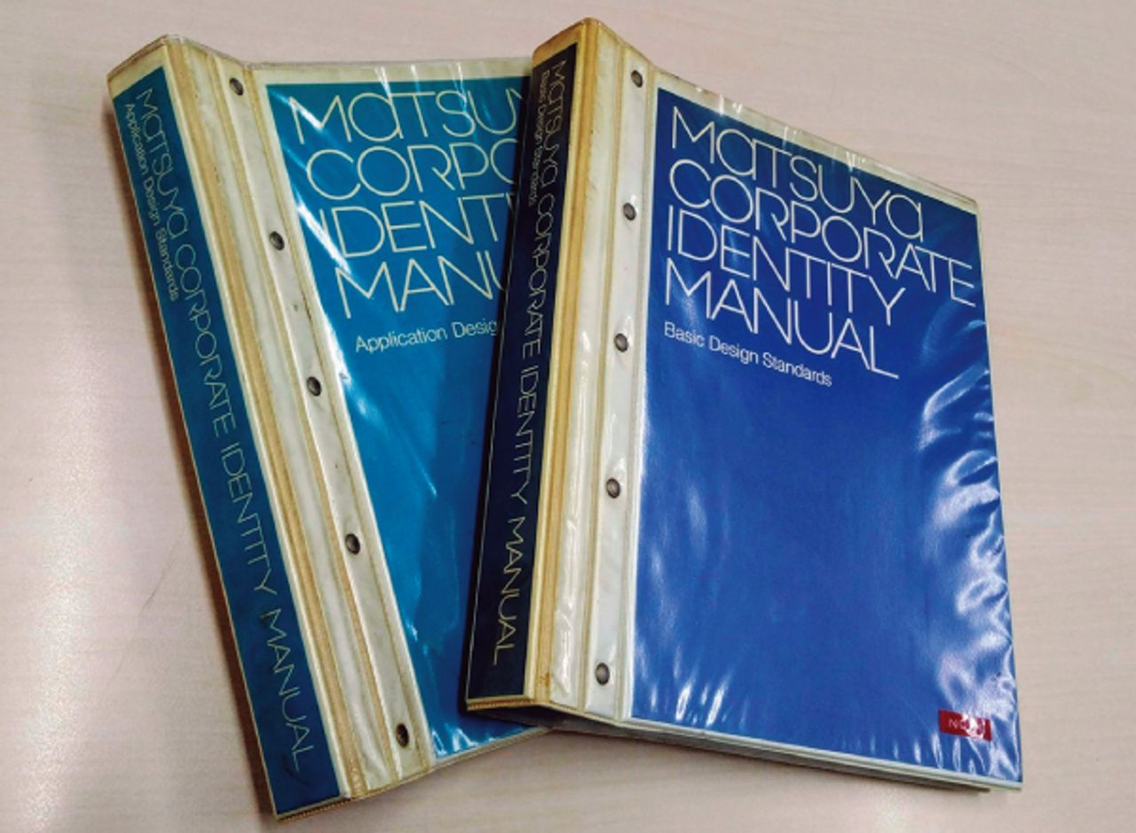
In January 1977, Vice President Susumu Yamanaka, who was invited from Isetan and later became president, commissioned CI strategy development to PAOS Inc. On September 30 of the following year, Matsuya Ginza had its first major renewal opening, during which a comprehensive CI overhaul was implemented.
Among ten submissions by four prominent graphic designers active both domestically and internationally, the winning design was by Masayoshi Nakajo, whose concept was the furthest removed from the “traditional department store symbol mark.” Nakajo is known for his designs such as Shiseido’s “Hanatsubaki,” Shiseido Parlour, and The Ginza. After Matsuya, he also created logos for Kagome, Spiral, and the Museum of Contemporary Art Tokyo.
The competition required designs that could be used for various purposes—posters, newspaper ads, wrapping paper, and shopping bags—with conditions emphasizing not only brilliance but also delicacy, meeting the demands of a progressive city adult. Nakajo’s design was judged the best to “reflect the concept” and be “new.”
This innovative logotype’s delicate and sophisticated urban sensibility perfectly matched the taste Matsuya Ginza aimed for. Nearly half a century after its introduction, it remains timeless, asserting its unique identity that sets it apart from other department stores.
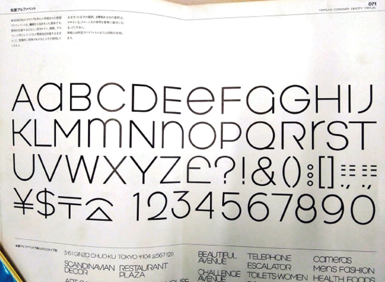
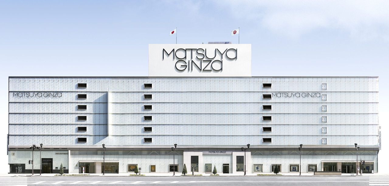
This logo has been used on the building exterior, various advertisements, wrapping paper, shopping bags, and even envelopes, earning support from customers. Many Matsuya fans seem to sense a “smart aesthetic” in this logo. Nakajo’s design, known as the “Matsuya Alphabet” (a unique adaptation of the Helvetica Light font), is also used on interior signage, helping to uniformly control the store’s personality.
As part of the CI change, it was also groundbreaking to adopt the store name as “Matsuya Ginza” instead of the more common “Ginza Matsuya” or “Matsuya Ginza Store.” By reversing the usual order of place name and store name, it creates a slight sense of unfamiliarity or a mental “hook” for people, thereby increasing attention. Furthermore, rather than being a simple “location + store name,” it emphasizes the unity between Matsuya and Ginza, leveraging the power of the “Ginza” brand to highlight the inseparable connection: “Matsuya means Ginza” and “Ginza means Matsuya.” This approach is similar to “Barneys New York,” which works because cities like Ginza and New York have strong brand value themselves. Moreover, it expresses Matsuya’s commitment and determination to “live together with Ginza.”
Author: Ken Tashiro
Principal of the Tokyo Fashion College of the Matsuya Group. With a career spanning over 40 years dedicated to the Matsuya Group, he has served as deputy editor for the "150-Year History of Matsuya" and held various other key roles.

Previous and next issues available here